A practical guide to text, transparency, and image editing
SEQUENCER
7 min read
Based on the Sequencer model catalog checked November 17, 2026. Covers are editorial illustrations.
Contents
The creative brief
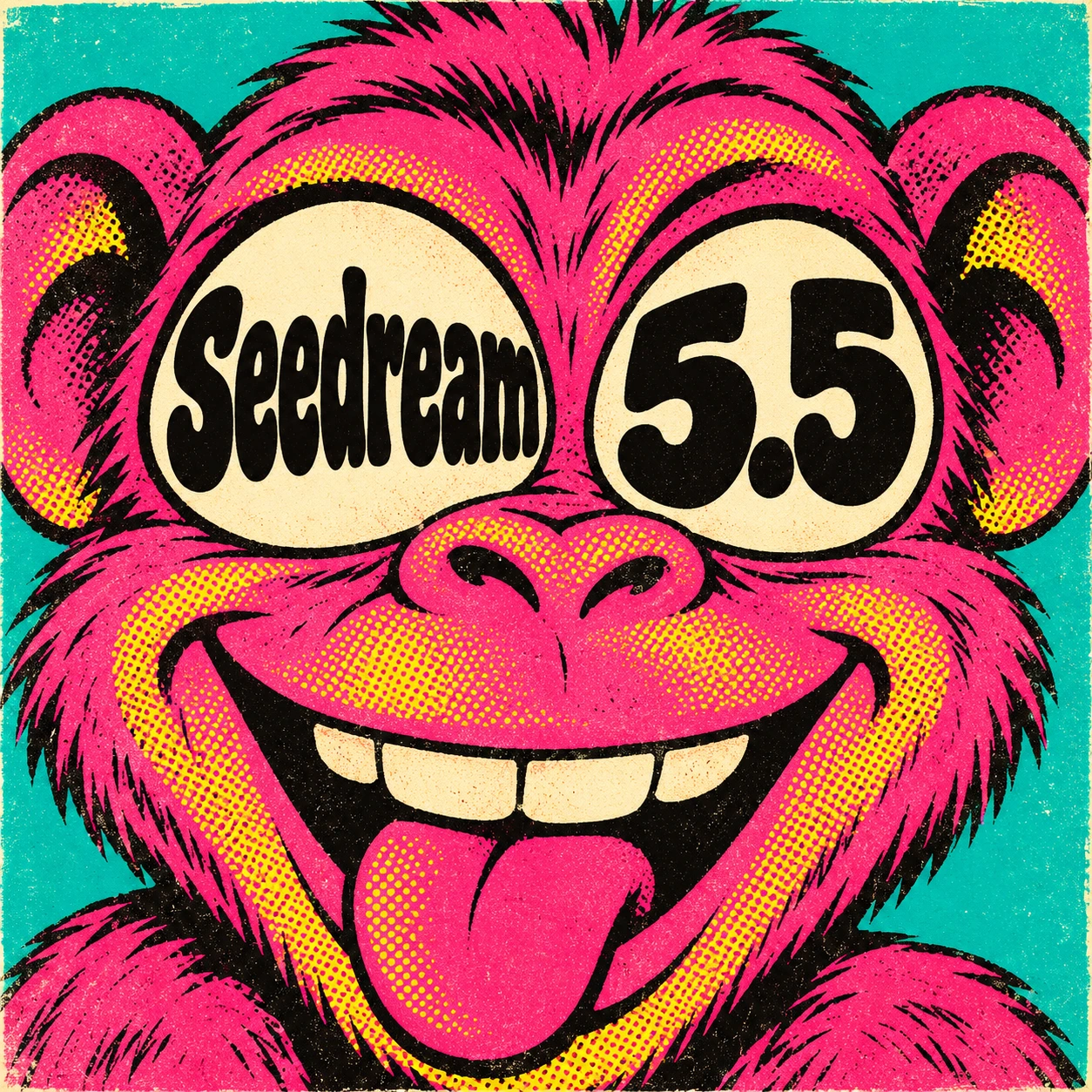
An eye chart would be easy. A word that has to double as a pupil is a more interesting brief. Seedream 5.5 gives illustrators two relevant controls in Sequencer: a choice of background and a canvas up to 2K. Select Transparent for a sticker or Opaque for a finished poster.
Text, cutouts, and successive edits
Seedream 5.5 is useful when the lettering is part of the picture. A label has to follow the curve of a bottle; a word inside an eye has to remain legible while taking on the shape of the pupil. Give each text element its own instruction, including its exact spelling, position, and relationship to the subject.
The background choice changes the deliverable. Transparent produces a PNG with an alpha channel for compositing. Opaque gives the subject a complete background. Auto lets the model interpret the brief. Select a specific mode when the asset has a known destination, such as a sticker sheet, a product listing, or a finished poster.
Sequencer settings
Seedream 5.5 settings in Sequencer
Setting
Available options
Resolution
1K, 1.5K, or 2K
Background
Auto, Transparent, or Opaque
Reference images
Up to 10
Make the illustration in four steps
Open the image studio, select Seedream 5.5, and choose the canvas shape for the final placement. A square works for this portrait. Keep that shape fixed while comparing lettering treatments.
Choose Opaque for the complete screen-print design or Transparent for a reusable cutout. Start at 1K to judge the face and letter placement; reserve a larger output for a composition you want to keep.
Use the prompt below. Quote each word separately and attach a reference only when it supplies a specific subject, composition, or visual treatment. Sequencer accepts up to ten reference images.
Inspect the result, then use it as a reference for the next revision. Ask for one change at a time, such as a larger decimal point or a wider left pupil, and check the surrounding drawing after each edit.
Try the prompt
Make a hot-pink screen-printed monkey. Put “Seedream” inside the left eye and “5.5” inside the right eye. Use the lettering itself as the pupils.
Read the small decimal point at thumbnail size. For a cutout, place the export on both black and white to inspect the fur edges. The base image rate is $0.023 at 1K or 1.5K and $0.04025 at 2K. Reference inputs can change the total.
Refine the lettering and edges
Judge the design at its intended display size. A word can read perfectly when enlarged and collapse into dark texture in a small social card. For this brief, the two eyes should still read as a face before the viewer notices the letters. If they compete, simplify the strokes around the lettering and give the decimal point more breathing room.
For a transparent export, test the same file over a light background, a dark background, and the actual layout. Inspect fine fur, enclosed spaces inside letters, and any pale fringe around the silhouette. Keep an approved version before each revision so you can compare the whole image and recover a detail that changed along the way.
Choose the deliverable before generating
Seedream 5.5 can serve several very different design assignments. A product cutout needs a clean silhouette and useful transparency. A poster needs a complete composition with room for its message. Packaging needs accurate wording, a convincing material, and text that follows the visible surface. Write down which of those you are making before choosing the background or gathering references.
For a product listing, begin with a view that explains the object clearly. Ask for a consistent angle and lighting direction across the range, then compare the silhouette against the approved product photograph. For a character sticker, prioritize the outline and the spaces between limbs. Small decorative marks that look appealing in a large preview can disappear or merge when the sticker is used in a chat or mobile interface.
For a finished campaign image, plan where the headline, product, and offer will sit. A cutout and a complete advertising scene can be separate deliverables. Approve the reusable subject first, then place it into a layout with editable type and a real brand background. This gives the design team useful options for a square card, a wide banner, and a portrait story.
Give each reference a specific job
The ten-reference allowance is a capacity, rather than a target. Start with the image that defines the subject. Add another only if it explains something the first cannot show, such as the reverse side of a package or the shape of a handle. Tell the model which picture supplies the product and which supplies the illustration treatment. Otherwise, a visually strong style reference can also influence the product geometry.
Keep the working reference large enough to show the details you intend to preserve. A tiny logo in the corner of a lifestyle photograph gives much weaker direction than a clear view of the same label. Crop a supporting reference around the relevant detail while keeping the full object available in the main image. Avoid presenting two different package versions as if they were the same product.
During successive edits, keep both the original subject reference and the last approved result available. State the requested change, its location, and the features that define the approved version. A useful revision is specific: change the eye lettering to a wider block style, keep the pink ink texture and face shape. Compare those preserved features after the edit before using the new output as the next reference.
Three more prompts to adapt
•
Product cutout: Create a straight-on image of the referenced green tea tin with its lid closed. Preserve the cylindrical body, silver rim, and printed label. Center the tin with clear space around its outline. Use a transparent background and soft, even product lighting. Check the label and rim against the reference before approving the asset.
•
Label study: Design a cream paper label on an amber bottle. Print “ORCHARD” as the main word and “APPLE TONIC” on a smaller line underneath. Keep both lines on the front-facing part of the label. Use dark green ink and generous spacing. Review each letter, then check whether the paper wraps naturally around the bottle.
•
Focused edit: Use the approved monkey illustration as the reference. Change only the ink palette to electric blue and warm ivory. Keep the expression, screen-print texture, eye shapes, and exact lettering. Preserve the square composition. Compare the new colors at the intended display size and check that the decimal point remains distinct.
Budget exploration and final output
The Sequencer catalog checked on November 17 lists base image rates of $0.023 for 1K and 1.5K, and $0.04025 for 2K. At those base rates, ten 1K attempts cost $0.23 and ten 2K attempts cost about $0.40. These are planning examples for the base image charge. Read the studio quote with the actual references and selected settings before submitting a generation.
Separate composition decisions from delivery decisions. Explore the subject, placement, and lettering at a working size, then generate the chosen treatment at the required resolution. Inspect the final output again because a new generation can change details. Save the prompt, references, and approved file together so a later color revision starts from the same visual decision.
Before delivery, check spelling, punctuation, edge quality, dimensions, and the actual alpha channel. A checkerboard painted into an opaque image is not transparency. Place the exported file over the destination background to confirm how fine fur and partial edges blend. Keep the editable layout alongside the exported image when the final asset includes a headline or price.
Common questions
Which background mode should I choose?
Choose Transparent when the subject will sit over another design. Choose Opaque when the background belongs in the finished image. Auto is useful for exploration; a specific background mode makes the delivery requirement clearer.
How do I improve small text?
Give the exact wording, name its location, and ask for enough space around each text element. Check punctuation and numerals individually. A larger output can help you inspect the result, while simpler lettering and clearer placement address the underlying composition.
What changes the generation cost?
Resolution and reference inputs affect the quote. Keep the prompt and references consistent when comparing 1K, 1.5K, and 2K. Read the current cost in the studio before generating, and include revision attempts in the asset budget.