Art direction, composition, and a complete cover workflow
SEQUENCER
8 min read
Based on the Sequencer model catalog checked November 17, 2026. Covers are editorial illustrations.
Contents
The creative brief
Recraft V4.1 is a text-to-image choice in Sequencer for art-directed composition. A cover portrait is a revealing assignment because success depends as much on the empty area as on the face. Give the model the crop, the light direction and the location of the future masthead.
Art direction starts with the layout
Recraft V4.1 is a design-oriented text-to-image model. Composition, materials, light, and color can all be stated in the prompt. For a cover, it helps to describe the areas reserved for design work as explicitly as the subject itself: where the face sits, how much of the rug remains visible, and which region needs quiet texture.
Sequencer’s V4.1 entry uses an aspect-ratio control and a text prompt, with fourteen supported shapes including portrait, square, and landscape choices. The assignment here is to direct a new image from text and evaluate it with a real cover layout.
Sequencer settings
Recraft V4.1 settings in Sequencer
Setting
Available options
Mode
Text to image
Composition
Specify the crop, lighting, and space for the masthead
Build the cover around real typography
Choose the final cover proportion first. Sketch the masthead, the face, and any supporting cover lines in a simple layout so the empty area has a specific purpose.
Open the image studio and select Recraft V4.1. Choose the closest supported aspect ratio, then describe the camera position, subject placement, light direction, materials, and the region reserved for the masthead.
Generate with the prompt below. Review the composition at thumbnail size and with the intended type overlaid. The upper part of the rug should remain calm enough for the masthead to read immediately.
Revise the placement or background pattern in the next prompt. Keep the successful light and color instructions while changing the region that conflicts with the layout. Compare the full cover after every revision.
Try the prompt
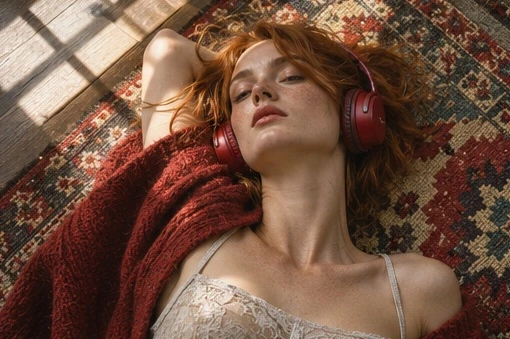
Overhead portrait of a listener on a woven rug. Red headphones echo one stripe in the fabric. Put the face in the lower left and leave a quiet patch of dark rug across the upper third.
Place the actual masthead over the result before approving it. If a rug motif cuts through a letter, ask for a simpler weave in that area. Deliver the type as a separate design element so an editor can change the headline later.
Make negative space do useful work
Empty space still has texture, tone, and direction. A dark rug can support a bright masthead, while a high-contrast stripe through the same area can break individual letters. Describe the upper third as a broad, low-contrast weave and place the strongest red accent around the headphones where it helps lead the eye toward the face.
Use the final crop as the approval surface. A composition that feels balanced uncropped may lose its quiet area when the publication adds trim, a logo, or a date line. Keep editable type in the design file so the editorial team can change wording and spacing. When rendered lettering is part of the illustration itself, specify its wording and inspect every character.
Turn a visual direction into a prompt
A useful art-direction brief names the composition, subject, materials, light, and color relationships. For the listening portrait, the overhead camera position explains how the rug and face share the frame. The red headphones provide a focal accent. The dark upper third creates a place for the masthead. Each instruction has a visible job in the design.
Start with a short hierarchy of decisions. State the camera and crop first, then the subject placement, then the environment and treatment. Add details that reinforce the intended hierarchy. If the face must be the first point of attention, avoid introducing several equally bright objects around it. If the headline needs a quiet area, describe the texture and contrast in that region.
Use concrete materials rather than a long list of mood words. A coarse woven rug, satin headphone cushions, and soft afternoon light give the scene physical relationships to solve. A restrained palette can then connect those materials. Review whether the result reflects those decisions at thumbnail size, where composition is easier to judge than fine detail.
Pick the shape before the detail
Recraft V4.1 provides fourteen aspect-ratio choices in Sequencer, including square, portrait, landscape, and elongated shapes. Choose the closest shape to the intended cover, card, or banner. A portrait cover and a wide website image need different distributions of subject and space. Selecting the final proportion early reduces the chance that a later crop removes the area reserved for the headline.
Sketch the major regions before generating: face, headphones, masthead, and supporting copy. The sketch can be a simple design note for your own planning. The V4.1 entry in this guide is a text-to-image workflow, so describe that arrangement clearly in the prompt. Keep the product’s final trim or interface safe area in mind when placing the strongest visual detail.
If the exact publication ratio falls between supported choices, leave enough room for the intended crop. Test the output in the real layout and mark the lost edges. Revise the prompt around the visible composition rather than approving the uncropped image and hoping the designer can recover the missing space later.
Three more art-direction prompts
•
Website hero: A sculptural white speaker on a low walnut plinth against a deep blue wall. Position the speaker in the right third, with a broad uninterrupted blue area on the left for a heading. Use soft side light and a single grounded shadow. Review the silhouette and the readability of the real heading at desktop and mobile crops.
•
Editorial illustration: A small orange boat crossing a field of dark teal water, viewed directly from above. Let one curved wake lead the eye from the lower left toward the boat. Keep the upper half quiet and textured with gentle ripples. Judge the balance of scale, empty space, and directional movement.
•
Packaging concept: A cream carton on a muted terracotta tabletop, photographed at a slight angle. Use one broad blue illustration on the carton and leave a clean front panel for editable type. Keep folds, edges, and the cast shadow clear. Review whether the shape can support the planned label layout before adding final wording.
Revise composition with a clear hypothesis
When a rug stripe crosses the masthead, revise the upper region specifically. Ask for a low-contrast weave across the upper third while preserving the red accent around the headphones. When the face is too central, specify a lower-left placement and enough visible rug around it. Each revision should test a clear composition decision.
Keep a short record of the prompt change and its effect. A new text-to-image generation can vary several details, so compare the full image rather than only the region named in the revision. If the background improves while the portrait becomes weaker, keep the earlier version available and refine the successful wording for another attempt.
Use a separate image-editing workflow when the assignment requires preservation of a specific approved frame. The V4.1 catalog entry used here starts from text. Choosing a tool with the required reference inputs makes a focused revision easier to define. Carry the approved composition and acceptance criteria into that next stage.
Price and finish the complete design
The Sequencer catalog checked November 17 lists Recraft V4.1 at a base rate of $0.046 per image. Ten base generations work out to $0.46. Read the current quote before generating and include the attempts needed to reach an approved layout. An inexpensive image still needs design time, typography, and final review before it becomes a finished cover.
Place the actual masthead and supporting copy over the selected image. Check contrast, letter spacing, face visibility, and the crop at both full size and thumbnail size. Keep headlines and date lines editable when the publication needs future changes. Save the final design file, exported cover, image prompt, and chosen aspect ratio together so the next issue can follow the same visual direction.
Common questions
Should I describe the empty area in the prompt?
Yes. Give it a location, an approximate size, and a visual character. For this cover, a calm dark upper third is more useful than a general request for negative space because it describes where the masthead will actually sit.
Can I use a reference image with this entry?
This Sequencer model uses text-to-image generation. Translate the important reference qualities into clear instructions about composition, palette, light, and material. Choose an image-editing or reference-guided model when the assignment depends on preserving a particular supplied image.
Should the model generate the masthead too?
Keep changeable cover copy as an editable design layer when the publication needs revisions. Generate integrated lettering when it belongs to the illustration, such as embroidered words or a sign in the scene, and inspect the finished spelling at delivery size.